Note: I was invited by Disney to attend the LA premiere of FROZEN last month, during which time I was able to see the new short ‘Get a Horse’ and chat with the filmmakers responsible for the movie. While my travel and accommodations were covered, no other compensation was received. All thoughts and opinions are my own. This review contains some spoilers.
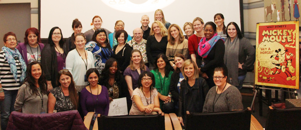
I knew nothing about the new short, GET A HORSE, showing before the feature film FROZEN, before I saw the movie. It wasn’t until I had sat down with Director Lauren MacMullan, Producer Dorothy McKim, CG animator Adam Green and Legendary Disney artist Eric Goldberg that I appreciated the full scope of what the team at Disney had accomplished with this short.
If you haven’t had a chance to see FROZEN in the theaters yet (what are you waiting for?) then check out this sneak peek trailer of GET A HORSE:
Get A Horse! Clip on Disney Video
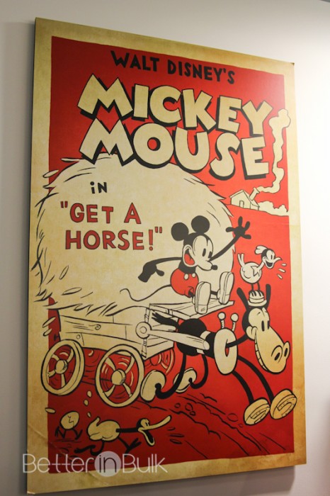
As GET A HORSE began, I had no idea that this classic-style animation was actually brand new. The animation was, in fact, drawn specifically to give it that old-style Mickey Mouse “flavor,” and it comes at a perfect time, as Mickey celebrated his 85th birthday November.
FUN FACT: Perhaps on of the most impressive things about GET A HORSE is the fact that Walt Disney himself provides the voice of Mickey Mouse, just like the “old days.” The team at Disney searched through everything that Walt Disney had recorded while he was alive and pieced together the dialog for the entire movie. Only ONE word in the movie was not found in the Walt Disney recordings. Watch the short and see if you can guess which word that was. John Lasseter was able to hear the difference, but my guess is that the average listener won’t pick it up. I certainly didn’t!
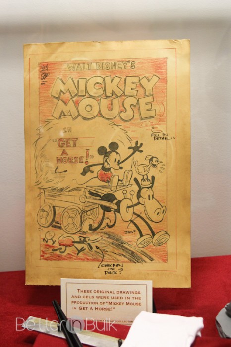
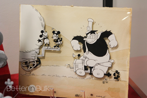
As the director, producer and animators discussed the evolution of Mickey Mouse and how he’s done everything from A (Apprentice to a sorcerer) to Z (Zookeeper) and so many things in between, it was a treat to take Mickey back to his roots. Long-time animator, Eric Goldberg, showed us the slight but important differences in the way Mickey was drawn then versus now.
Eric Goldberg explained Mickey’s evolution, all while drawing the new and old-style Mickeys in front of us. It was brilliant to watch him!
“So the Mickey that most of us have been drawing and animating for the last 20 years or so, for the most part has been the 1939 Mickey that was designed by Freddy Moore. Freddy Moore was one of the greatest Disney animators ever.
One thing that he brought to the Mickey of this period was a sense of looseness and fluidity for the character. One of the most notable things, of course, is that he had whites and pupils in his eyes. And you can see that he had a lot of fluidity for the way his mouth would fit into his cheek. They put a little bit of drag on his ears to give that a little bit of a fluidity.
Walt’s earliest Mickey starts with a more rounded circle, a slightly more pronounced snout.
…Just take those eyes and fill ‘em in black, and you can already tell, he’s gone back a couple of decades. He had a slightly pointier nose, and sometimes he wouldn’t even connect up the mouth to the bottom of the muzzle. He would give him a front facing tongue for a 3/4 view, slightly smaller and rounder ears that did not have a lot of drag on them.
As far as his body goes, it was not a pair shape, it was like a barbell. It was two circles connected by two straights. His legs, generally speaking, would be bowed while he was standing still. His feet looked like bricks with shoes on them.
So he’d have great angled elbows. His hand cuffs would kind of stick out that way. And as far as arms and, and hands and fingers go, forget it. Bananas.”
And here comes the spoilers: The old-style animation and story would have been entertaining enough…but about halfway through the short, Mickey literally came flying through the screen into the theater. I’ve seen the short in both 3D and 3D, and as I recommended in my FROZEN movie review, I would urge everyone to see the movie in 3D just to see GET A HORSE in 3D. It was THAT spectacular.

“GET A HORSE!” Peg-Leg Pete attempts to spoil the fun in “Get A Horse!”—opening in front of “Frozen” on Nov. 27, 2013—but Mickey Mouse has a few tricks up his sleeve. Featuring Walt Disney himself as the voice of Mickey, the never-before-seen short made its U.S. premiere Aug. 9 at the D23 Expo to a surprised crowd of more than 4,000. ©2013 Disney. All Rights Reserved.
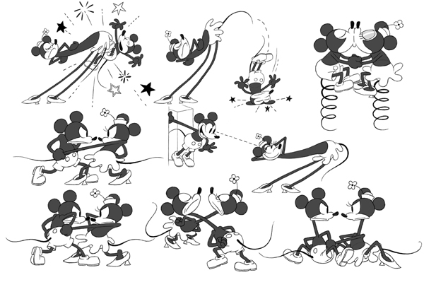
As Mickey emerges from the black and white 2D animated story, he becomes full color (Shouting, “Red!” when he sees his own clothes in color for the first time) and fully 3 dimensional. The movie’s characters interact between the 2D and 3D world, creating an exciting and hilarious finish to their story. I was completely fascinated.
Both traditional paper and pencil animators and modern CG animators worked side by side to create something totally new, totally surprising.
Said CG animator Adam Green, the animation was “done simultaneously by their hand drawn and CG animators. A constant back and forth was going on, where the 2D animators would be animating Minnie hanging from his hand, and [a CG animator would] animate Mickey in the foreground, chasing them, and pulling the curtains back and forth.
And they would constantly update one another with the latest version of the hand drawn, the latest version of the CG, make sure all the eye lines were working, and that kind of cooperation was great, you know, to have both camps kind of working for the same goal.”
Their goal proved to be fruitful. The results were stupendous.
Have you seen FROZEN in the theaters yet? Let me know what you thought of the short GET A HORSE!
FROZEN and GET A HORSE are in theaters NOW
https://www.facebook.com/DisneyFrozen
https://twitter.com/DisneyAnimation (#DisneyFrozen and #GetaHorse)
https://www.pinterest.com/disneystudios/frozen/
https://www.disney.com/frozen
© 2013, Food Fun Family. All rights reserved.
Leave a Reply